Pebble Hill Primary
Design Statement/Philosophy
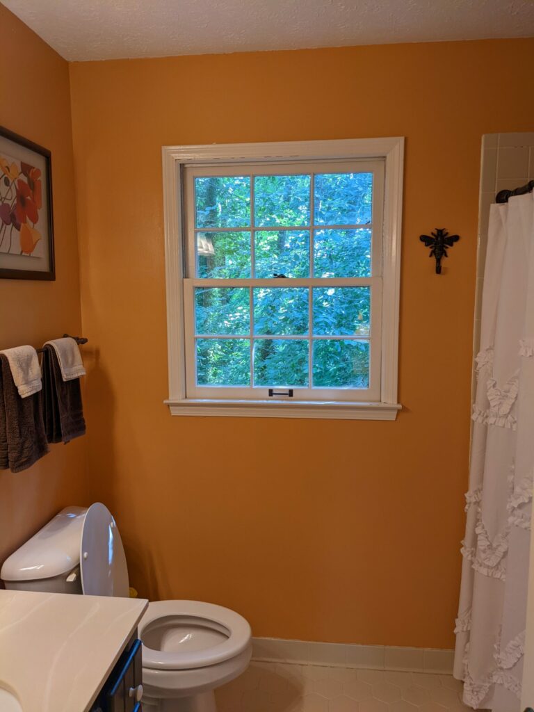
By expanding their small, outdated current bath into an existing closet, the clients’ goal of creating a larger, retreat-like master bath for their home was realized.
Design Overview/Challenges
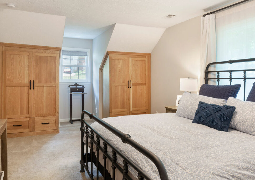
Their cramped, existing bath, of only 44 square feet, desperately needed attention and wanting a larger walk-in shower, a dual-vanity sink and storage was going to be a tight squeeze to make, even with the newly obtained space. Luckily, during the demo phase of construction, the space thought to be an HVAC chase, ended up being empty, giving us not only extra square footage, but the possibility for a more functional layout. And while space was gained, it was necessary to ensure that the clients didn’t sacrifice storage from the project’s closet reduction. So, the underutilized space under the clipped ceilings in the master bedroom, was captured to create custom built-ins. Giving not only function to the space, but also adding two eye-catching focal points to an otherwise overlooked area in the master bedroom.
Project Overview/Solutions
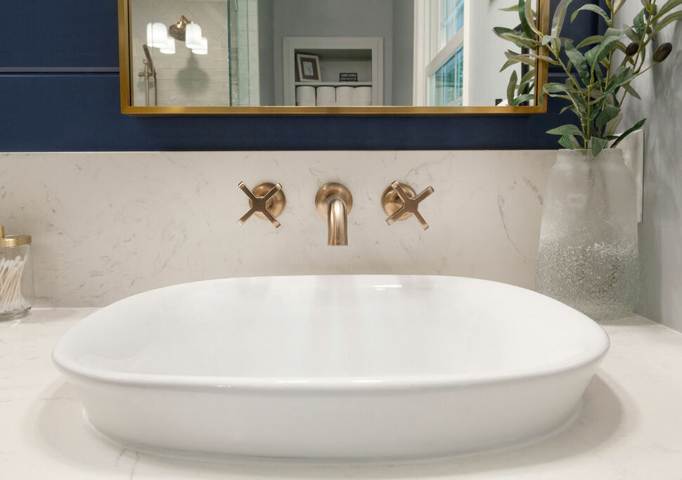
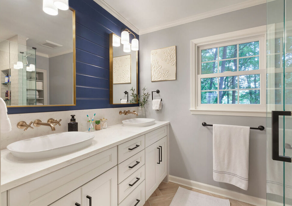
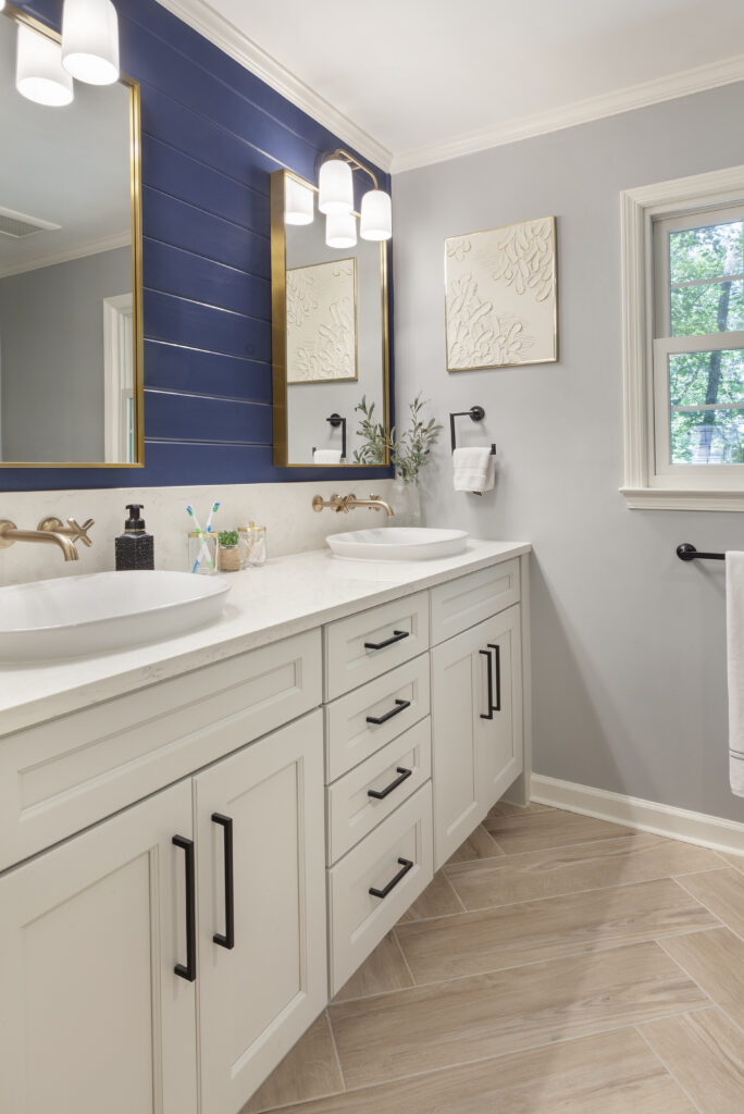
- Combining champagne bronze/luxe gold and black finishes for the accessories and fixtures evokes a relaxed, but luxurious feel.
- Separate sinks, with wall mounted faucets and semi-recessed sinks, for both users of the bath.
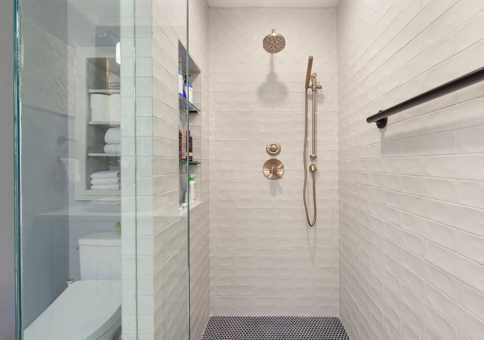
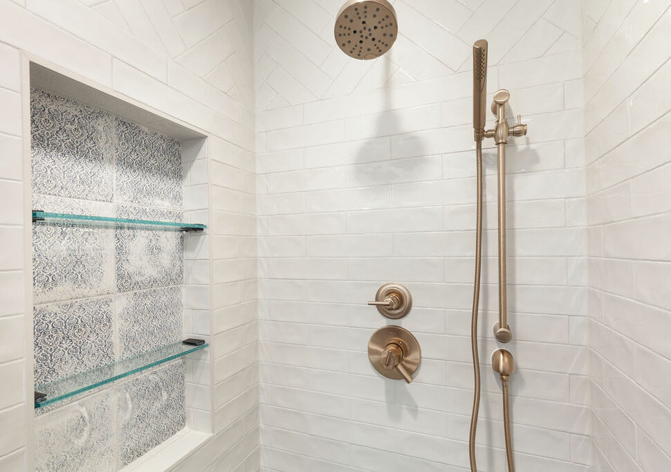
- Laid in a running bond at the lower part of the shower, the off-white, elongated subway tile was arranged in a herringbone pattern as well, adding a subtle, but elegant feature to the top of the surround.
- An oversize shampoo niche, with 3 shelves, was positioned to showcase the lovely rustic patterned tile selected by the client. Setting up a secondary focal point within the bath.
- By thickening the wall behind the toilet and recessing an open shelf cabinet, matching the vanity, in the space above the toilet, created additional bath storage.
- A pocket door to the bath facilitates unimpeded flow into the space.
- Staging the space for a striking look, shiplap, painted in a rich blue, was added to the vanity wall.
- A lightly veined quartz counter surface topped the light grey double vanity with shaker style doors.
- Because the space is still on the small side, a clear glass shower enclosure was desired to bring more light and open views into the bath.
From the start I was impressed with the design ideas Stephanie and Amy presented. They listened to our vision and worked with us to create a plan that brought it to life. The regular meetings to choose finishes helped us feel deeply involved in the decision-making process....The attention to detail and craftsmanship are evident in every aspect of the design. The overall combination of design meets build and commitment to client satisfaction truly shines in the finished project.
Amy E. | Marietta, GA

